
Exploratory Data Analysis with F#, Plotly.NET, and ML.NET DataFrames
Using Polyglot Notebooks to explore datasets with F# & Plotly.NET
This article is my entry as part of F# Advent 2023. Visit Sergey Tihon’s blog for more articles in the series by other authors.
One of the most common tasks with data roles is the need to perform exploratory data analysis (EDA).
With EDA a data scientist, data analyst, or other data-oriented programmer can:
- Understand the value distributions of their data
- Identify outliers and data anomalies
- Visualize correlations, trends, and relationships between multiple variables
Exploratory data analysis usually involves:
- Loading the data into a DataFrame
- Performing descriptive statistics to identify the raw shape of the data
- Visualizing variables of interest on their own or with other variables.
In this article I’ll walk you through the process of loading data from a sample dataset into a Microsoft.Data.Analysis DataFrame (the kind featured in ML.NET). Next, we’ll look at the descriptive statistics the DataFrame class provides and then explore the process of creating some simple visualizations with Plotly.NET.
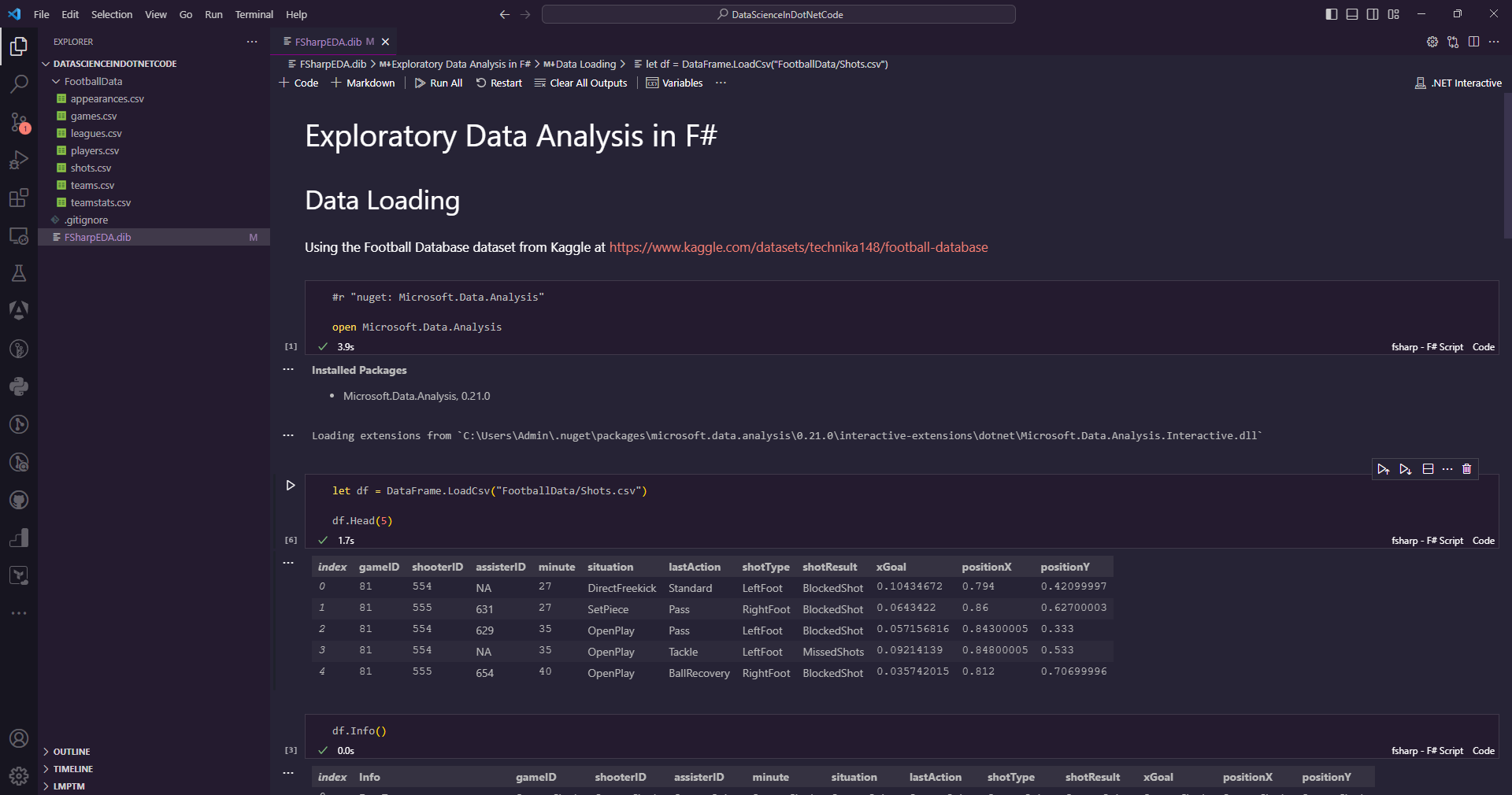
All of this will be accomplished inside of a single Polyglot Notebook. If you’re not familiar with Polyglot Notebooks, they’re a technology built on top of Jupyter Notebooks that allow you to use additional language kernels, including a F# Kernel. This lets you run interactive data science experiments in a single notebook as shown here in VS Code:
Note: Polyglot Notebook is not required for most of the code in this article. I use it as an ideal place to render charts and make iterative adjustments, but you can use these technologies without Polyglot if you prefer
If you’re looking for more information on Polyglot Notebooks, I’ve written many articles on the topic and will be publishing a book covering it further in Q3 of 2024.
For now, let’s get rolling and see how to perform EDA with F#.
Loading Data into a ML.NET DataFrame
In this article we’ll be exploring a single data file from a larger dataset. Specifically, we’ll be looking at Technika148’s Football Database on Kaggle.
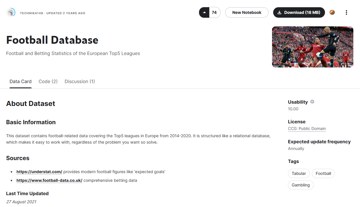
This dataset covers the top 5 European football leagues and contains information on players, games, leagues, and teams. For readers in the States like me, football here is what we call soccer, not the sport featured annually in the Super Bowl.
We’ll be analyzing the data found in the Shots.csv file in the dataset which contains details on every shot on goal for these leagues over a 6 year period.
I started by downloading the dataset and unzipping the files so the .csv files were on disk in a FootballData directory.
Once that’s done, you’ll need to create a new Polyglot Notebook and add code to import the Microsoft.Data.Analysis NuGet package and open it for usage in F#:
#r "nuget: Microsoft.Data.Analysis"

open Microsoft.Data.Analysis
Once the NuGet package is referenced and opened, we can load the data from our data file into a DataFrame object and show the first few rows of the dataset:
let df = DataFrame.LoadCsv("FootballData/Shots.csv")

df.Head(5)
In a Polyglot Notebook this will show the first 5 rows of data. Note that the Microsoft.Data.Analysis package also includes extensions for Polyglot Notebooks. This allows DataFrames to be easily visualized and paged through without needing to write custom visualizers.
To illustrate this, you can end your cell with just df to get the extension’s visualizer for your full DataFrame:
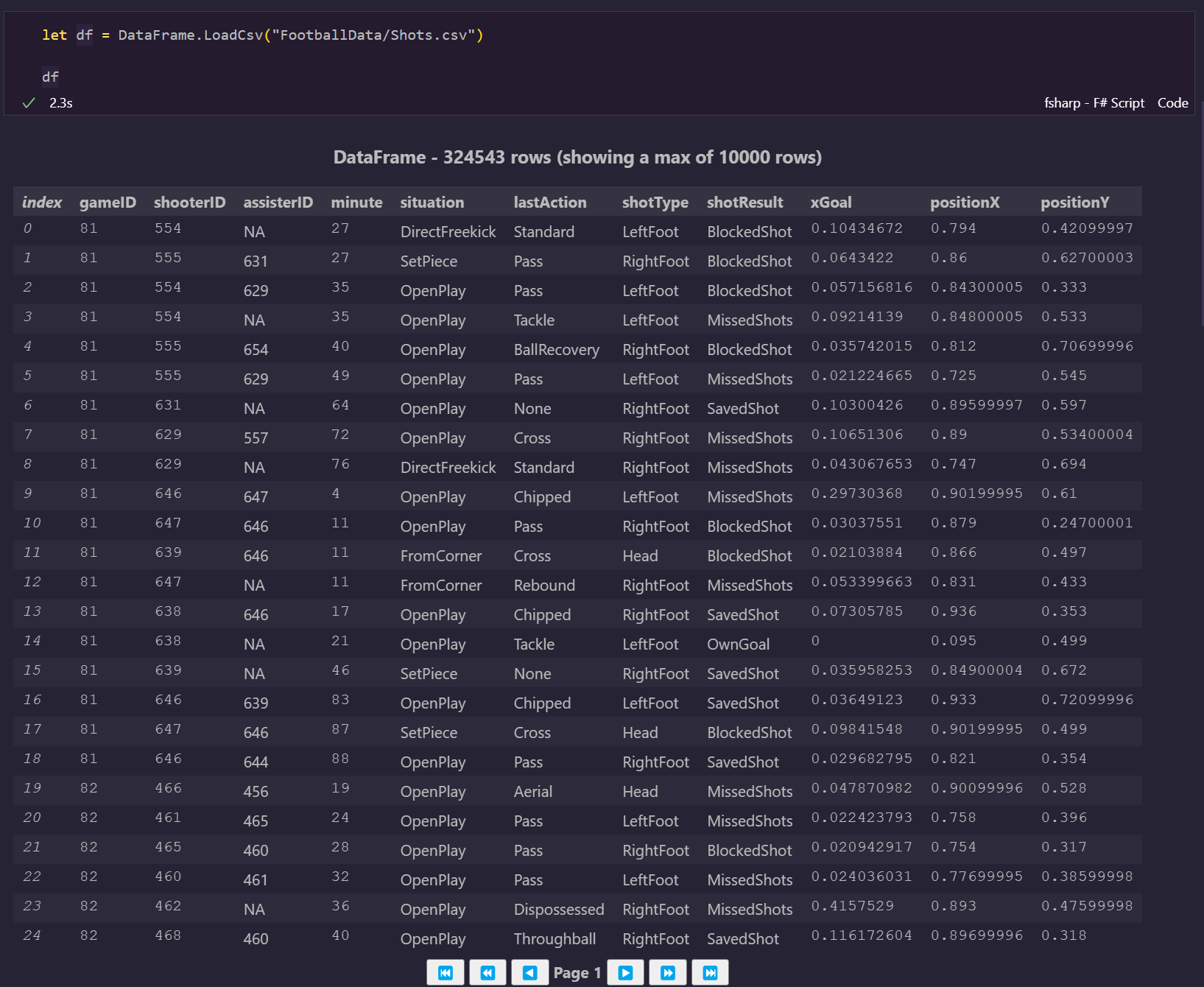
You can compare the data here to the dataset’s information on Kaggle, but as the visualization here indicates, the DataFrame contains 324-and-a-half thousand shots on goal, so it is a sizeable dataset.
Note: Many F# developers use the Deedle Frame instead of the Microsoft.Data.Analysis DataFrame I feature in this article. Deedle is a valid alternative, but I’m writing this article around DataFrame because not much documentation exists on using DataFrame, F#, and Plotly.NET and I want to provide some through this article.
Whichever library you use, when you’re dealing with any volume of data one of the most helpful things you can do is look at how the various columns are distributed.
Performing Descriptive Statistics
The first thing I like to do with a Microsoft.Data.Analysis DataFrame is understand its columns. The Info method is handy for this since it gives you a detailed breakdown of the column types and the number of values in each column:
df.Info()
This call displays a smaller DataFrame with the characteristics of the data:
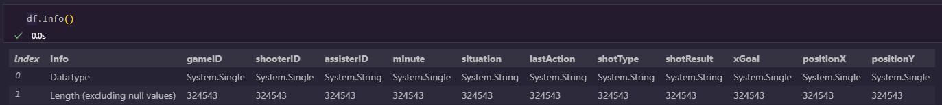
It looks like this dataset has a number of Single columns and a few String columns. Just for clarity, Single here is not talking about the relationship status of the column, rather it refers to a single precision floating point number, commonly called a float.
Also note that each column has the same length. This is fortunate because it tells us that all columns have the same number of non-null values, meaning the data is likely to be devoid of nulls.
We can confirm this with the Description method:
df.Description()
This shows us the range of values for each column, including the minimum, maximum, and average (mean) value:
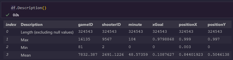
While it’s tempting to gloss over tabular data, this information here highlights some useful trends in the data:
xGoal,positionX, andpositionYappear to be percentages ranging from 0 to 1.- There have been around 16,000 games in this dataset and the average game number appears near the midpoint of that. This means shooting volume hasn’t significantly changed in that time.
- Minute ranges from 0 to 104. This makes since since football games are 90 minutes long typically but may have extra minutes depending on stoppages in action.
- The length of values here is identical to the
Infocall results, and nonullvalues appear in theMincolumn.
Now that we have a better understanding of the characteristics of the data, let’s see how we can visualize this dataset using Plotly.NET.
Setting up Plotly.NET and Extracting Values from DataFrames
There are many charting options for .NET in a Polyglot Notebook, including ScottPlot, the older XPlot Library, and Plotly.NET. I’m a big fan of Plotly for data visualization in Python, so I choose it when I can in other languages too. However, Plotly.NET is also becoming the defacto standard for data visualization in .NET notebooks.
To work with Plotly, we’ll import its NuGet package along with a helper package for Polyglot Notebooks:
#r "nuget: Plotly.NET"
#r "nuget: Plotly.NET.Interactive"

open Plotly.NET
In the next few sections we’ll be visualizing the same columns in multiple ways. To keep our charting code easy to read, let’s introduce variables to hold the values in our columns of interest:
let goalProximity = df["positionX"] |> Seq.cast<single>
let horizontalPos = df["positionY"] |> Seq.cast<single>
Here we define a goalProximity variable to store the proximity to the opponent’s endline where 0 indicates a team’s own endline and 1 indicates the opposing team’s endline. We also introduce horizontalPos which contains the location a shot occurred on the pitch with 0 being the left sideline as you face the goal, 1 being the right sideline, and 0.5 being the middle of the field.
To compute these values we take the column from the DataFrame using an indexer and the column’s exact name. We then pipe that using |> into Sequence function to convert the column values in to a sequence of single values. These sequences are what Plotly.NET needs for its visualization work.
Let’s look at some sample visualizations that show distribution of these two data points.
Visualizing Variable Distributions with Plotly.NET
Analyzing a single variable is called univariate analysis (sorry, I’m a data analytics guy) and helps spot interesting trends and outliers in the data.
We typically perform univariate analysis with one of the following methods:
- Descriptive statistics, including some of the methods shown earlier in this article
- Box plots showing the distribution of data
- Violin plots (related to box plots)
- Histograms showing more precise data locations
Box Plots in Plotly.NET
We’ve already covered descriptive statistics, so let’s start with a box plot showing the horizontal locations shots are taken on the pitch:
Chart.BoxPlot(X = horizontalPos)
    |> Chart.withTitle "Horizontal Position of Shots"
    |> Chart.withXAxisStyle ("Horizontal Position", ShowGrid = true, ShowLine = false)
This produces the following box plot:
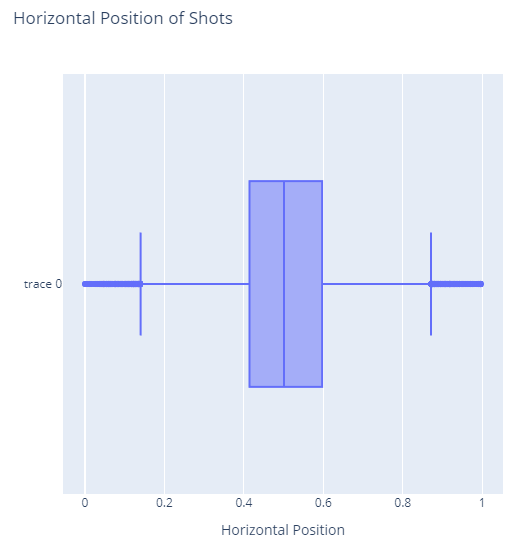
This box plot shows the distribution of shots across the field horizontally by visualizing where the lower and upper quartile bounds are with vertical lines and the Q2 to Q3 range with a large shaded box. The median value is shown with a line through the box at almost exactly midfield. We also see outliers beyond the traditional upper and lower bounds showing a few shots taken from extreme angles.
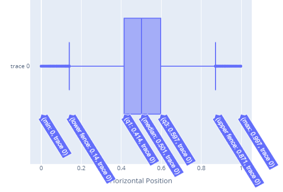
Plotly includes interactive tooltips as well, when you move your mouse over the visual as shown here:
Overall, this plot shows that shots tend to be taken from the middle of the field and the distribution of shots from the right and left edges is close to symmetrical with slightly more shots taken from the right side of the pitch, but not a significant imbalance.
Let’s compare this box plot to one of proximity to the opponent’s goal for different shots:
Chart.BoxPlot(X = goalProximity)
    |> Chart.withTitle "Proximity to Goal"
    |> Chart.withXAxisStyle ("Proximity to Goal", ShowGrid = true, ShowLine = false)
This produces the following box plot:
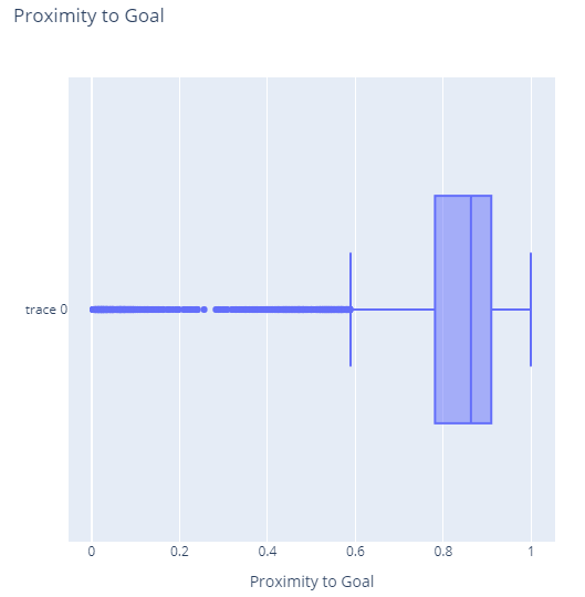
Clearly, this is a much different distribution of data, with most shots coming from around 78% to 90% of the way to the opponents goal. Additional shots come from either closer to the net (including right at the endline) or as far back as 60% of the way to the opponent’s goal. However, there are also a number of outliers showing shots taken from as far back as the team’s own endline.
I’m not much of a football fan, but to me this tells the story of most shots coming from around the penalty box, with some shots being made in desperation from farther back.
Box plots don’t tell you too much, so let’s look at Violin Plots which enhance the visual depth with more context.
Violin Plots in Plotly.NET
Let’s start just by looking at a violin plot of the horizontal position of shots:
Chart.Violin(X = horizontalPos)
    |> Chart.withTitle "Horizontal Position of Shots"
    |> Chart.withXAxisStyle ("Horizontal Position", ShowGrid = true, ShowLine = false)
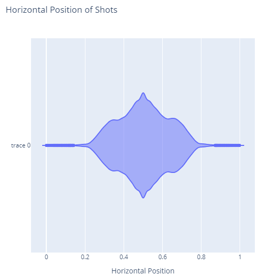
This drops the box notation of box plots and instead shows the distribution of values at a more granular level. Here we see that most of the shots occur almost exactly at mid-field with a sharper drop off as we reach the sides. This also makes it much more clear how much of an outlier shots from the extreme edges are.
I love violin plots, but in my experience they’re used less frequently than box plots for communication and as a result can be harder for others to interpret.
Let’s see a violin plot for the goal proximity:
Chart.Violin(X = goalProximity)
    |> Chart.withTitle "Proximity to Goal"
    |> Chart.withXAxisStyle ("Proximity to Goal", ShowGrid = true, ShowLine = false)
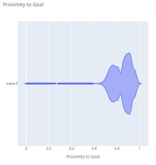
This plot is interesting to me because it shows an almost bi-modal distribution with a main peak of shots at 90% of the way to the goal - around where the penalty box would be - and another smaller peak at 76% of the way to the goal.
Without more football knowledge I can’t say why we’d see this second smaller peak, but I suspect this represents a common strategy teams employ of shooting as they approach the attacking area as defenders close in. If you have more knowledge and insight in this domain and have some ideas, I’d love to hear them in the comments section!
For now, let’s move on to look at data at a more granular level using histograms.
Histograms in Plotly.NET
Histograms show the distribution of values as a vertical bar chart that breaks down nearby values into “bins”. For example, if you were to represent values from 0 to 100 with 20 bins, the first bar would be a bin containing values from 0 up to 5, the second would have values from 5 up to 10, and so on.
You can think of a histogram as a slightly different format of a violin chart, or perhaps think of a violin chart as cross between a box plot and a histogram.
A picture is worth a thousand words, so let’s make a histogram of horizontal locations of shots:
Chart.Histogram(X = horizontalPos)
    |> Chart.withTitle "Horizontal Position of Shots"
    |> Chart.withXAxisStyle ("Horizontal Position", ShowGrid = true, ShowLine = false)
    |> Chart.withYAxisStyle ("Count", ShowGrid = true, ShowLine = false)
This produces the following chart with a massive spike in the middle:
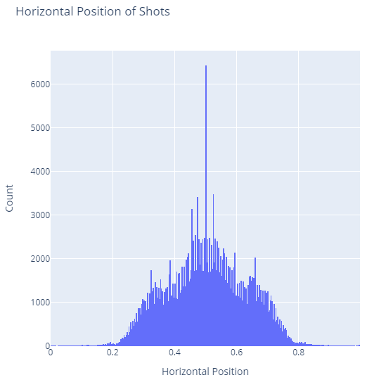
You’ll likely notice that this histogram resembles the violin plot from earlier, but this highlights a massive spike in the center where roughly 3x more shots occurred than any other place.
My suspicion is that this spike comes from penalty kicks and also potentially kicks from the center mark.
Let’s look at a similar histogram of goal proximity:
Chart.Histogram(X = goalProximity)
    |> Chart.withTitle "Proximity to Goal"
    |> Chart.withXAxisStyle ("Proximity to Goal", ShowGrid = true, ShowLine = false)
    |> Chart.withYAxisStyle ("Count", ShowGrid = true, ShowLine = false)
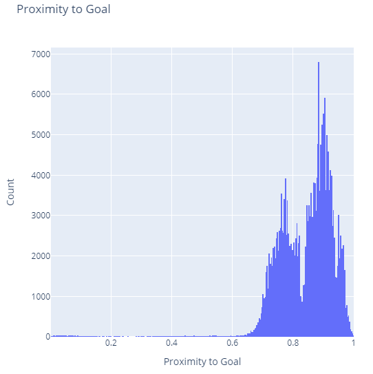
Like our violin plot before, we see the same multi-modal chart, but this time a few more peaks are evident such as a smaller peak near the goal box. We also see a single high peak at around 88.5% of the way to the goal, which I suspect is for penalty shots. We don’t see any sort of spike around 0.5 which rejects my theory from a moment ago that some of the horizontal centered shots might be on kicks from the center mark.
So far we’ve focused on analyzing distributions of a single variable. Let’s shift gears and focus on analyzing pairs of variables together.
Multivariate Analysis with Plotly.NET
When we analyze multiple variables together, we call this multi-variate analysis. Analyzing variables together can help identify correlations, associations, and trends. These can help identify opportunities and relationships and validate assumptions about your data.
There are many different ways to visualize data together, but in this article I’ll cover:
- Scatter or Point charts
- 2D Contour Diagrams
- Point Density Charts
We’ll start with the simplest of these: point charts.
Scatter Plots with Point Charts in Plotly.NET
Point charts in Plotly.NET are what I would consider a scatter plot elsewhere. However, they flow through the Point method with the Scatter method being reserved for other things, so I’ll call them Point Charts here for clarity.
A point chart in Plotly.NET should look familiar by now:
Chart.Point(x = horizontalPos, y = goalProximity)
    |> Chart.withTitle "Position of Shots"
    |> Chart.withXAxisStyle ("Horizontal Position", ShowGrid = true, ShowLine = false)
    |> Chart.withYAxisStyle ("Proximity to Goal", ShowGrid = true, ShowLine = false)
Here instead of specifying a single value we specify two values.
This produces the following rather busy chart:
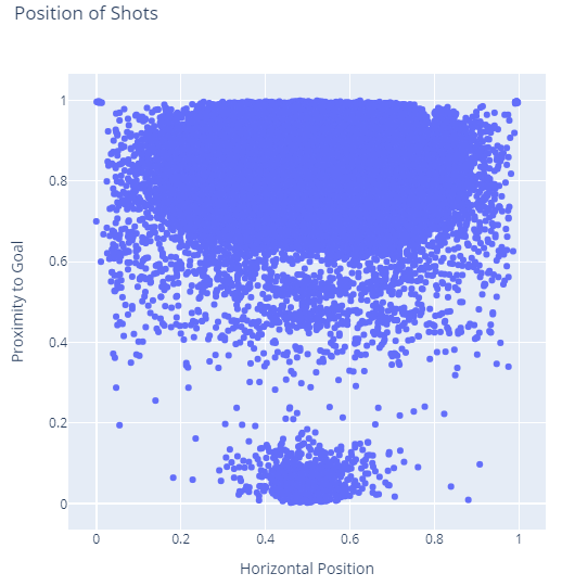
This is a very busy plot because so many shots have occurred in our dataset. However, it does make it clear that shots can come from almost anywhere in the attacking areas of the pitch and come infrequently from other places. The chart also highlights corner kicks at the top left and right corners as you would expect.
Curiously there are many shots clustered around the defending goal. I read these values as one of two things:
- These represent cases where the keeper or a defender just kicks the ball downfield to clear out of a tough situation
- These could also represent cases where players accidentally kick the ball in a way that makes the keeper need to make a save
I think it could be a combination of the two of these factors, since I know this dataset does include own goals. Further analysis of data points would help explain these points, but is beyond the scope of this article.
Heatmaps with 2D Contours
Our point chart is useful for spotting unusual shots, but it’s less useful for making sense of the shots in the attacking zone.
To make sense of these values, let’s create a heatmap using the Histogram2DContour method:
Chart.Histogram2DContour(x = horizontalPos, y = goalProximity, ContourLine = Line.init (Width = 0.))
    |> Chart.withTitle "Position of Shots"
    |> Chart.withXAxisStyle ("Horizontal Position", ShowGrid = true, ShowLine = false)
    |> Chart.withYAxisStyle ("Proximity to Goal", ShowGrid = true, ShowLine = false)
This produces a heatmap of sorts showing the density of shots in this dataset:
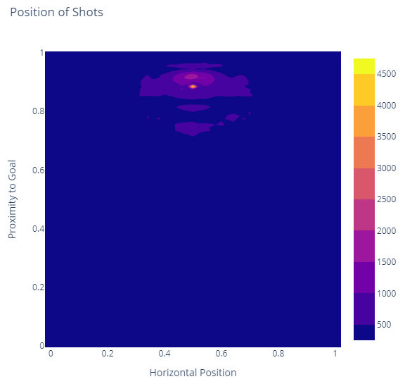
Here we can clearly see the heavy shot areas around the goal and penalty boxes as well as a few patches of higher activity areas approaching these areas. It also shows a horizontal strip in front of the goal where players are in prime position to handle passes from others, head the ball into the net, and other high-intensity goals at close range.
Note here that this code customizes the ContourLine parameter. This is optional, but makes the line bordering the different “heat” zones less pronounced, which is helpful for this dataset.
In showing the heatmap here, we do lose a lot of the outlier information we had from previous charts. Let’s look at point density charts to help with this.
Point Density Charts
A point density chart is a combination of the heatmap from the 2D contour chart plus the outlier context of a scatter plot.
The code for this is rather familiar:
Chart.PointDensity(x = horizontalPos, y = goalProximity)
    |> Chart.withTitle "Position of Shots"
    |> Chart.withXAxisStyle ("Horizontal Position", ShowGrid = true, ShowLine = false)
    |> Chart.withYAxisStyle ("Proximity to Goal", ShowGrid = true, ShowLine = false)
This produces a somewhat noisy chart that combines our last two charts:
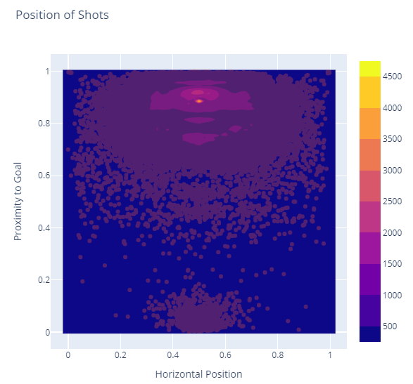
This one chart keeps our high-heat area near the attacking goal but blends in points from all those other outlying infrequent shots as well.
Next Steps
As you can see, we can use F#, Plotly.NET, Microsoft.Data.Analysis DataFrame objects, and Polyglot Notebooks for a rich exploratory data analysis experience.
There are many more ways this data could be visualized and ways of improving the charts, adding in new charts, and refining and filtering our dataset. However, this article covers the basics of tying these technologies together to tell the beginnings of an exciting data story.
In 2024 I’ll begin work on a larger book that works with datasets like this to tell a compelling data analytics, machine learning, and artificial intelligence story centered around Polyglot Notebooks, .NET, Plotly.NET, ML.NET, and a few AI capabilities including OpenAI and Semantic Kernel.
This book is tentatively titled “Data Science in .NET with Polyglot Notebooks”. If it sounds interesting to you, give me a follow. You can also check out my last book Refactoring with C# if you’re interested in more of my thoughts on software engineering.