Understanding Regression Metrics
Using regression metrics to evaluate machine learning models
Regression at a Glance
In this article we’ll explore the common metrics you’ll see evaluating the performance of a trained machine learning model for a regression task.
Regression experiments are one of the 3 core machine learning tasks and used for predicting a numerical label given a set of features and training data.
An example regression scenario I’ve done involved training a machine learning model to predict the total number of penalty minutes that could be expected when any two NHL hockey teams play each other.
By the way, this is a real experiment I’ve performed recently using Azure Machine Learning Studio and its Python SDK. If you’re curious about the process, take a look at my article and video on the project for more details.
At a high level, a trained model in this experiment takes in a home team, an away team, and whether or not the game is a playoff game. The model then outputs a prediction about the total number of penalty minutes that the model expects between the two teams combined. A well-performing model like this could potentially be used to help the league assign its more experienced officials to high-risk games and improve player safety as a result.
But how do we know if a trained regression model is good enough to deploy? Well, in order to do that, we need to examine its metrics.
The Importance of Metrics
In machine learning it can take a lot of time and effort to understand a problem, collect a data set, structure an experiment, and train a machine learning model. But once you have a trained model, how do you know if that model performs well enough to rely on to make real-world predictions that could impact someone’s life?
In order to evaluate how reliable your machine learning models are, you consider a series of metrics, like the following set of regression metrics available in Azure Machine Learning Studio:

This can be both awesome and intimidating at the same time, so let’s talk about what we’re measuring and what these metrics mean.
Error and Common Regression Metrics
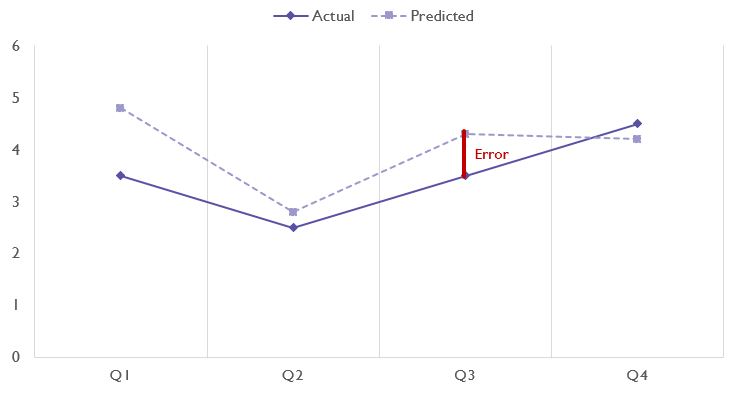
In regression tasks, when we look at the performance of our models, we’re measuring how accurately they predicted values given a set of features, so we measure our model’s performance in terms of error or distance between the correct value and the value our model predicted. Error is sometimes also referred to as residuals.
However, because our models are not just predicting a single data point but are actually predicting many different data points given different sets of features (in our example, we would use our model to predict the expected penalty minutes for many different pairings of teams), we need to look at the average error as well as extreme error scenarios.
Error is calculated as error = actual - predicted.
An error of 0 is preferable here meaning that the model was completely accurate, however the error might be either positive or negative depending on whether the prediction was larger than the actual value or less than the actual value.
There is no upper or lower limit around errors. For example, if a game actually had 5 penalty minutes and my model predicted there would be 600 penalty minutes, the error would be 595. However, the closer to 0 error is, the more accurate your model is.
Residuals Histogram
Azure Machine Learning Studio offers a histogram of residuals so you can see the general tendency of your model’s error and if most values tend to be clustered around 0, are low, or are high.
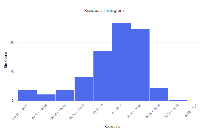
The above histogram is left skewed and tells us that this model tends to have positive error, or estimates larger values on average than the actual observed values, but there are cases where it also underestimates values and has negative residuals.
Mean Absolute Error (MAE)
The Mean Absolute Error or MAE refers to the average error of the model over all of the training data. The word absolute means that if error happened to be negative, we are treating it as if it were positive.
We could represent this in pseudocode as:
MAE = Average(Abs(error)) or MAE = Average(Abs(actual - predicted))
By using absolute we protect ourselves against a scenario where a model has one prediction with an error of 100 and another with an error of -100. In that scenario, if we averaged out the errors, the model would look like it had an average error of 0 or being a perfect model.
By using the absolute value, this earlier scenario becomes 100 and 100 which average out to have a MAE of 100 helping us identify performance issues.
Thinking about MAE another way, MAE is all about how wrong the model is on average, regardless of if the model predicts above or below the actual value.
Root Mean Squared Error (RMSE)
Root Mean Squared Error or RMSE adds up the squared error of all predictions, divides them all by the total number of data points, and then gets the square root of that number.
RMSE = Sqrt(Sum(actual - predicted) ^ 2 / numDataPoints)
Because RMSE squares prediction error, unusually bad predictions will have a larger impact on the total score.
Low RMSE values are better than high RMSE values and a 0 indicates a perfectly fit (or overfit) model.
Relative Absolute Error (RAE)
Relative absolute error or RAE is a ratio of the mean absolute error divided by the average difference of each actual value from the overall average value in the data.
RAE = MAE / (Average(Abs(actual - averageActual)))
To illustrated how our denominator is calculated, let’s say our data has actual historical values of [10, 15, 11]. The average of those values would be 12 and each element would have absolute distances from this of [2, 3, 1]. The average of this set of numbers is 2 which serves as our average actual difference from the overall average in the historical data. This denominator therefore serves as a function of how distributed our data is.
As with most other measures of error, lower values for RAE are better. A notable feature of RAE is that if RAE is less than 1, the model performs better than simply relying on the average value.
Relative Squared Error (RSE)
Relative Squared Error or RSE takes the sum of all errors, squares that number, and then divides by the sum of the squared difference between the actual values and the average actual value.
RSE = Sum(error ^ 2) / Sum((actual - averageActual) ^ 2)
This is very similar in concept to the relative absolute error, except it squares the error instead of averaging it.
Because errors are squared, differences from the average or actual values have a greater impact on the result, which can heavily penalize datasets that have a few scenarios with unusually high error relative to the rest of the predictions. This is a major feature of RSE because this metric makes those outliers more visible.
As with most error metrics, a low RSE is ideal with 0 meaning a perfectly fit (or overfit) model.
Root Mean Squared Log Error (RMSLE)
The Root Mean Squared Log Error or RMSLE metric is very similar to Root Mean Squared Error but it relies on logarithmic actual and predicted values.
RMSLE = Sqrt(Sum(Log(actual + 1) - Log(predicted + 1)) ^ 2 / numDataPoints)
The introduction of logarithms to the equation adds additional sensitivity to errors, making outliers even more prominent.
Predicted vs True Chart
A Predicted vs. True chart, like the one below from Azure Machine Learning Studio helps you get a good overall picture of your model’s performance across different numerical ranges.
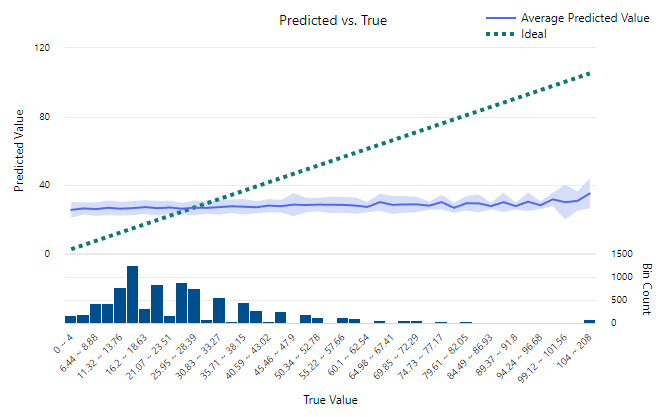
The chart above illustrates one of my NHL Penalty Minute Prediction models and shows a very lackluster model. The X Axis is a histogram indicates the correct value that we’re trying to predict (in this case the number of penalties in a game) and the Y Axis indicates the values our model predicted for that range. The blue band indicates the range of values our model is predicting, which seems fairly static in this example. In a perfect model this blue band would follow the dotted green ideal line and indicate a completely accurate model.
The key advantage of the predicted vs true chart is that it can highlight predicted value ranges where your model is significantly less reliable that might not otherwise show up in other statistical measures.
Explained Variance
Explained variance (or explained variation) is the sum of all squared errors in the model which can be expressed as follows:
ev = Sum((actual - predicted) ^ 2)
With explained variance there is no upper limit to values, but a lower value is ideal with 0 being no error in the model whatsoever.
R Squared / Coefficient of Determination
R Squared, or the coefficient of determination, is one of the most popular regression metrics and measures the percentage of a model’s variance that can be explained by the model.
R squared values range from 0 to 1 and, unlike most other regression metrics, higher numbers are better with R Squared.
The exact formula for R Squared is a bit more involved, but the value serves as a measurement for how much of the validation data can be explained by the resulting model with a value of 1 indicating that the model perfectly explains all data without any error.
While other measurements are intentionally sensitive to outliers, the R Squared metric is more focused on the overall accuracy of the model.
Spearman Correlation
The spearman correlation is an advanced metric that measures how strong the association between our dataset’s features and predicted label. This is another way of measuring how well our model represents the relationships we observe in the data.
Spearman’s Correlation ranges from -1 to 1 with 0 meaning no correlation, -1 meaning a strong negative or inverse correlation, and a 1 meaning a strong positive correlation. 1 is the ideal value in a model.
Mean Absolute Percentage Error (MAPE)
Mean Absolute Percentage Error, or MAPE is a great way of getting an overall percentage indicating how accurate the prediction system is overall.
MAPE is calculated roughly as follows:
MAPE = 1/n * (Sum(Abs(actual - predicted) / actual))
Mean Absolute Percentage Error is useful for understanding the average behavior of the prediction model and is especially helpful in communicating accuracy to people not familiar with other metrics. However, due to this lack of familiarity, you should also endeavor to share additional metrics or an overall summary that illustrates any weaknesses the model may have with outliers or ranges of values that may not be adequately captured in the MAPE metric.
Median Absolute Error
Median Absolute Error is the middle-most value when you take all of the absolute error from model predictions and sort them in ascending order.
This can be calculated with the following pseudocode:
medAE = median(abs(actual - predicted))
The median value might not seem incredibly helpful, but by focusing only on the median error amount this metric can effectively ignore even the most extreme outliers, which gives it an interesting perspective to our model.
Normalized Error
Most error metrics do not have a firm upper bound to them. Values of 0 indicate no error exists in the model and are ideal, but it can be hard to interpret the full range of errors.
To fix this, we can normalize our error metrics to fall within a range of 0 and 1 with 0 meaning the least error encountered and 1 meaning the largest amount of error the model encounters. This takes our error metrics and makes them easy to interpret in terms of a percentage.
This is typically done by dividing the overall error metric by the full range of error values. This is the same thing as the largest error minus the smallest error.
This process gives us the following metrics:
- Normalized Mean Absolute Error
- Normalized Median Absolute Error
- Normalized Root Mean Squared Error
- Normalized Root Mean Squared Log Error
These metrics are collectively helpful in seeing how values fall along ranges and give you a rough way of relating two different models to each other.
Closing Thoughts
So which measurements should you rely on the most in your regression experiments?
It’s up to you to determine what the most important features of your model are, but in general I try to look at:
- Mean Absolute Error is an easily understandable first metric to look at to see how good the model is on average (low is better)
- Median Absolute Error helps decouple the mean absolute error from outliers by just looking at the median (low is better)
- R Squared and Spearman Correlation both give you a more nuanced look at the model’s ability to make sense of features to generate predictions (high is better)
- A Predicted vs True chart to determine where my model is strong and weak
- A Residuals chart to see how many cases there are where my model is extremely off in its predictions
It’s up to you which prediction scenarios are most important to you in your model and how much you care about outliers, but personally I would never want to recommend a model without having a Predicted vs True chart and some supporting metrics to put forth to support that recommendation.
Additional Resources
If you’re looking for additional resources and context, checking out Microsoft’s documentation on metrics is a great next step, but nothing beats training a model of your own and evaluating how it performs.
Also, stay tuned for more content from me on binary and multi-class classification metrics in the near future.